React Transition Group

You can view a video tutorial running through this here or by tapping the above image, and I've provided a Github repository with all code in the example
I was recently building a React application in which users could add or remove inline tags. I found it a bit jarring that clicking the add button caused a brand new tag to blast onto the screen immediately, and clicking to remove the tag caused the tag to immediately vanish in a fwoosh. As someone who spends much of his time thinking about great experiences, the jarring nature had me reaching for a softer, CSS animation solution.
Fading in elements is pretty easy using CSS 3 animations, so I implemented those first, but was immediately at a loss for how to elegantly handle the fade out for each component, which would require adding some set of “transition-out” css classes programatically as the element was removed. This would require yet another solution for the cradle to grave life of these tags to achieve the effect I wanted.
In comes React Transition Group, which seamlessly allowed me to implement transition effects for components as they entered and exited. It’s a technology I enjoyed using so much I thought I’d document my experience with it for others to build on and as a quick guide for myself.
My Test Application
I built a quick little test application to show the effect, which you can see in this Github Repository. The point was to show a very simple set of objects that transitioned in and out when you tap on them and I used three primary technologies.
- React Transition Group - the big kahuna of the tutorial, I utilized its two components
<TransitionGroup>and<CSSTransition>to apply CSS classes on demand to handle my fade in and out effects I desired. - Styled Components - Rather than having a separate style sheet, Styled Components allows me to edit my CSS right next to the JSX I use to build my component, making component styling easier to compartmentalize and follow.
- React Hooks - Well known at this point, I used the
useStatehook to manage the state of my application from the top of the Component tree inApp.js.
I’ll mainly focus on the file TileGroup.js as this holds all the React Transition Group logic, but the above libraries were used to develop the end-to-end example you see.
The App
The App has a few components that make it up, but most relevant to understanding Transition Group is the nested components of App.js > TileGroup.js > Tile.js. I wired the application so that whenever the AddButton component is pressed, it updates the state of the application, which is then passed to TileGroup, which then creates a Tile for each object stored in the state.
For this reason, outside of the Styled Components to make it look pretty and the addItem and removeItem functions to manage state, the App.js is super simple.
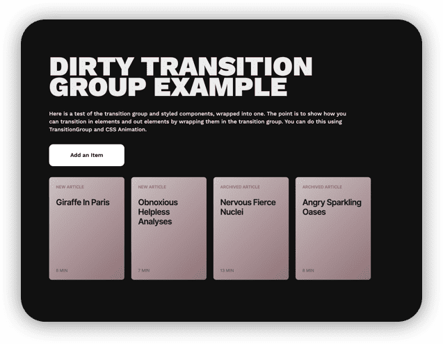
<Container>
    <StyledH1>
        Dirty Transition Group Example
    </StyledH1>
    <IntroText>
        Here is a test of the transition group and styled components...
    </IntroText>
    <AddButton label={"Add an Item"} addItem={addItem}></AddButton>
    <TileGroup items={items} removeItem={removeItem}></TileGroup>
</Container>
The Tilegroup
For the sake of example, the above snippet is what the TileGroup would look like without using any Transition Group magic. It’s simply a functional component which takes in the list of items as props, and then iterates over those items to create a unique Tile component for each item in the state. But no transition in and transition out animation would be included, so every time a Tile was added or removed it would simply flash off the screen.
const TileGroup = props => {
    return (
        <StyledGrid>
            {props.items.map(item => (
            <Tile
                {...item}
                removeItem={() => {
                props.removeItem(item.id);
            }}
            ></Tile>
            ))}
        </StyledGrid>
    );
};
Below is what the finished product looks like using Transition Group. Note the TileGroup component has the exact same structure with the exception of adding in <TransitionGroup and <CSSTransition> which we will unpack below. I refactored this base code to include Transition Group.
import { TransitionGroup, CSSTransition } from "react-transition-group”;

...
const TileGroup = props => {
    return (
        <TransitionGroup component={StyledGrid}>
            {props.items.map(item => (
            <CSSTransition key={item.id} timeout={300} classNames="transition">
                <Tile
                {...item}
                removeItem={() => {
                props.removeItem(item.id);
                }}
                ></Tile>
            </CSSTransition>
            ))}
        </TransitionGroup>
    );
};
Take notice of a few nuances
- The
TransitionGroupcomponent becomes a wrapper for the whole experience. Previously I used a styled componentStyledGridas the wrapper. which applied all the grid styling I wanted for the container. If you do not specify acomponentprop for theTransitionGroup, Transition Group will simply create a new div that holds all the functionality. If you do pass in a component, the specified component will assume all the functionality of the Transition Group. Thus, I passed it my originalStyledGridcomponent as to not have to rejig my CSS to account for this extra div in the DOM. - Each
Tilecomponent is now wrapped in a new, critical component, theCSSTransitioncomponent. This must be a direct child of theTransitionGroupcomponent with no intermediate ancestors in between the two, or else you begin to get some weird behavior. - The
CSSTransitioncomponent carries a few argument.keyis standard to include when mapping over elements in React. Thetimeoutspecifies how long it is going to apply the CSS classes necessary to facilitate the transition in milliseconds, so in this case I want my transition to last for about a third of a second. TheclassNamesprop corresponds to what set of CSS classes the component will attach to achieve the transition effect. This is very important to set and have correspond to your CSS.
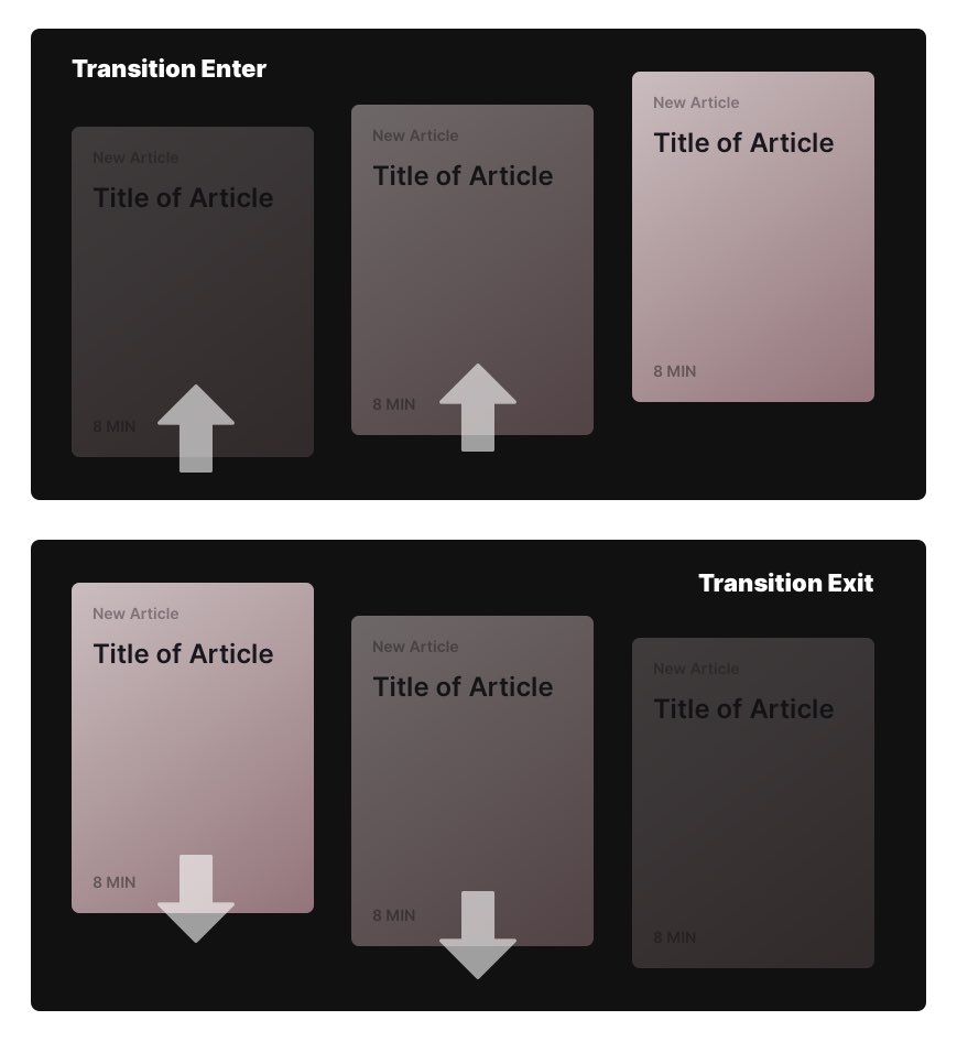
What does this look like? I used the classNames=transition and above in my styled component, I defined those css classes to look like the below snippet. Note each class begins with transition- because of the settings within the CSSTransition Component.
.transition-enter {
    opacity: 0.01;
    transform: translate(0, -10px);
}

.transition-enter-active {
    opacity: 1;
    transform: translate(0, 0);
    transition: all 300ms ease-in;
}

.transition-exit {
    opacity: 1;
    transform: translate(0, 0);
}

.transition-exit-active {
    opacity: 0.01;
    transform: translate(0, 10px);
    transition: all 300ms ease-in;
}
Now, because of TransitionGroup orchestrating the elements coming in and out, and CSSTransition applying classes to each individual Tile as it gets added, you will notice in your DOM via Dev Tools that transition-enter and transition-enter-active get applied over that 300 millisecond time window, and same with the -exit and -exit-active classes. The orchestration between the component and these CSS classes is what achieves the desired effect.
Conclusion
It takes a little getting used to, but once you understand the basics, I found it to be a delightful way to ensure my components got the animation treatment I desired. Again if you want to follow along more closely; take a look at the Github Repository or watch the video which goes a little more in depth on the solution.